The system, made visible.
A name that describes a method, not an ambition.
Two halves, each doing work.
GAMECHANGER
Not the cliché. The founder was a game changer in the literal, criminal sense: a player who altered the outcome of matches. The name keeps that fact in view rather than hiding it, because the company's authority comes from having been inside the problem.
360
Integrity fails at the seams between functions. Education in one department, reporting in another, monitoring bought from a supplier, legal called too late. 360 is the claim that the whole circle has to be covered, and the mark is drawn as a closed loop for the same reason.
Four rules that decide every design question.
Evidence over adjectives
We show the number, the instrument, the case. If a claim cannot be sourced it does not appear, in a deck or on a page.
Calm under pressure
This brand is read by people handling an allegation on a Friday night. Nothing shouts, nothing flashes, nothing celebrates.
Structure you can see
Hairlines, grids and generous space, because the product's whole argument is that connected structure beats scattered effort.
Signal, used sparingly
Green means something is live, active or true. Used everywhere it would mean nothing, so it is used almost nowhere.
One lockup, two grounds.
The wordmark sets on two lines with the 360 mark carrying the brand gradient. The mark alone is used where the full lockup would be illegible: app icons, favicons, avatars and compact interface.



Clear space and size
Keep clear space around the lockup equal to the height of the 3 in the 360 mark. Nothing enters that area, including image edges.
Full lockup: 28mm wide in print, 160px on screen. Symbol: 8mm wide in print, 24px on screen.
Do
- Use the supplied vectors, never a screenshot or a redraw
- Light lockup on dark grounds, dark lockup on light grounds
- Keep the 360 numerals in Signal Green or the brand gradient
- Place the lockup on a plain ground, or over an image with a scrim
Do not
- Recolour, outline, stretch, skew or rotate the lockup
- Add a drop shadow, glow, bevel or container box
- Rebuild the wordmark in another typeface
- Set the lockup on a busy image without a scrim
- Separate the wordmark from the mark in a new arrangement
One accent. Three grounds.
The palette is deliberately small. Deep green and ink carry almost every surface, mist carries the light ones, and Signal Green does one job.
Signal Green
Active, live, true. Emphasis only, never a background for body text.
Intelligence Teal
Secondary accent. Links and icons on light grounds.
Integrity Deep Green
The primary brand ground. Panels, covers, headers.
Ink
Dark canvas. Long-form reading on dark, the footer, the page openings.
Mist
Light canvas. Light sections and documents.
Paper
Panels and cards on a light canvas.
Signal Green on ink clears WCAG AA for large text and for interface elements. It does not clear AA for body text on white, so it is never used for running text on a light ground.
Space Grotesk and Manrope.
A geometric display face with real character for headlines and figures, and a humanist sans that stays readable at length. Both are open source, so a partner can match our typography without a licence.
Display
Space Grotesk
Medium 500, Bold 700
Headlines, product lockups, figures, eyebrows and any number a reader has to trust.
Integrity is infrastructure.
ABCDEFGHIJKLMNOPQRSTUVWXYZ 0123456789
Body
Manrope
Regular 400, SemiBold 600
Body copy, interface, labels, long-form reading and every form.
Education, secure reporting, live monitoring and an intelligence core, connected.
ABCDEFGHIJKLMNOPQRSTUVWXYZ 0123456789
- Headlines set tight: negative tracking, line height near 1.05
- Body copy sets at 1.6 to 1.7 line height and never exceeds 70 characters a line
- Eyebrows are uppercase Space Grotesk at 0.16em tracking
- Numbers use tabular figures so a column of them aligns
- Never use a monospace face for dates or counters. It reads as filler.
One stroke weight, never filled.
Icons are functional labels, not decoration. They sit in an outlined tile on cards and bare in lists, always at a single stroke weight so a row of them reads as one system.
- 1.25px stroke at any size
- Outlined, never filled and never two-tone
- Rounded caps and joins
- 24px grid, drawn on the same optical weight
- One icon per idea. If two icons could mean the same thing, use words instead.
The moment before, not the celebration.
Photography is documentary and low-key: empty stadiums, tunnels, floodlight haze, an athlete alone. We do not use trophy lifts, crowd euphoria or handshake stock. The subject of this brand is pressure, not victory.
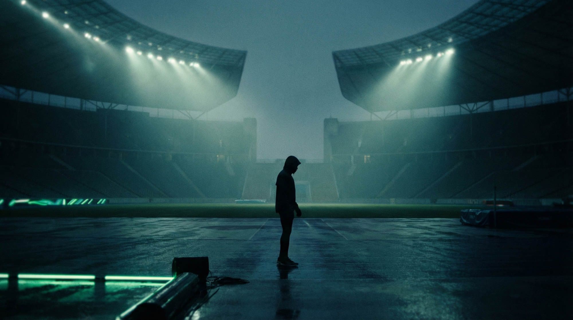
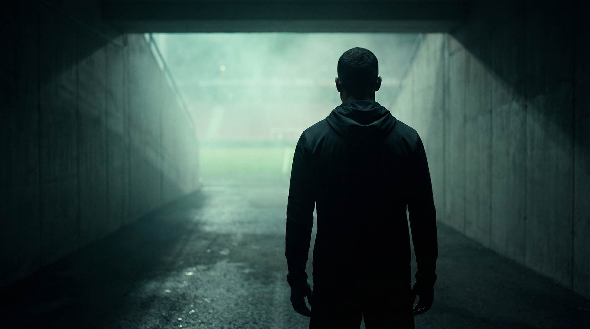
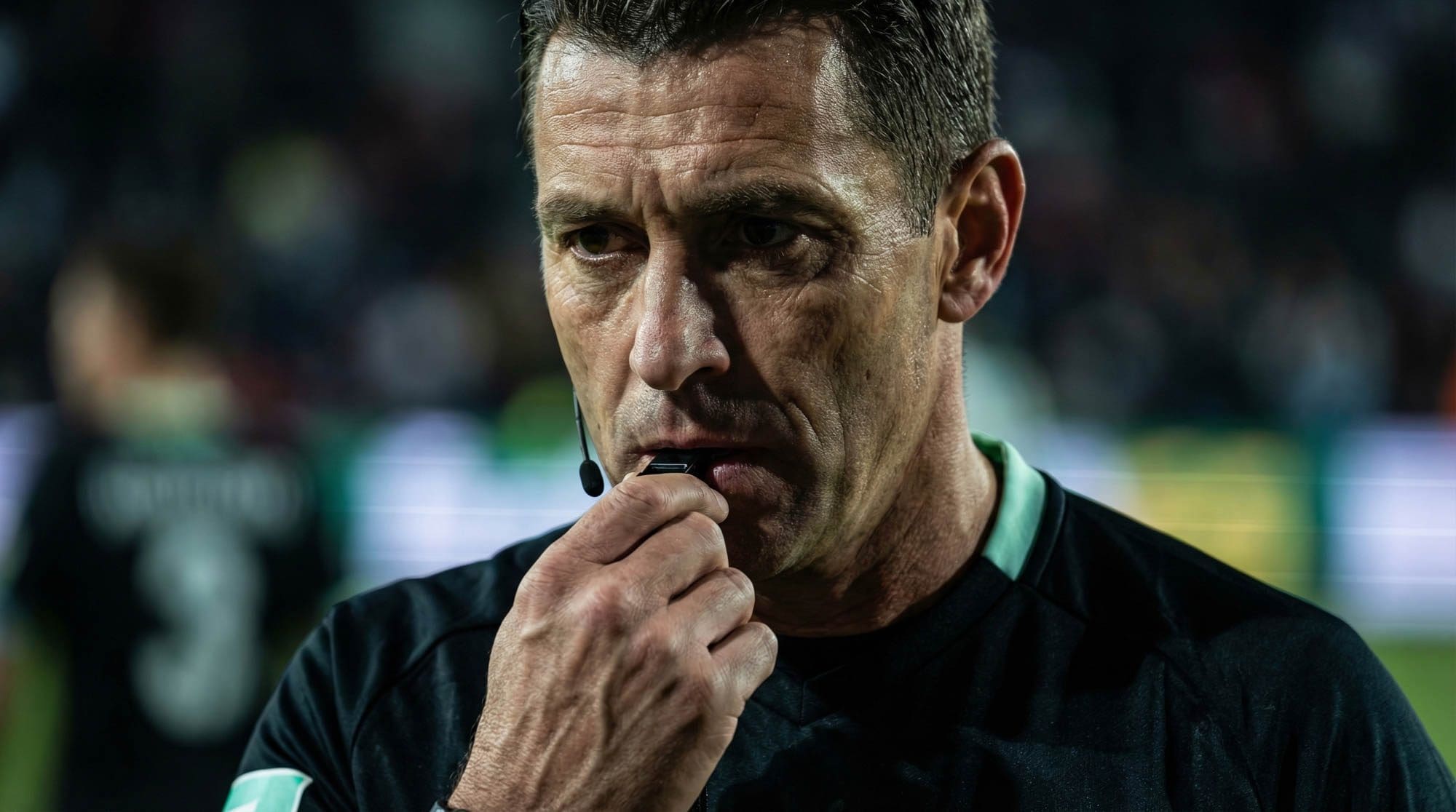
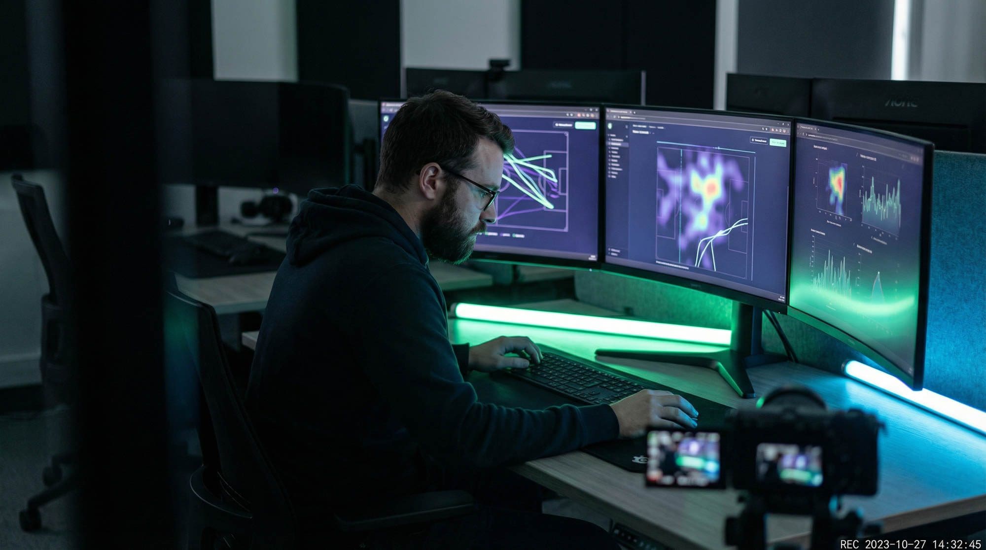
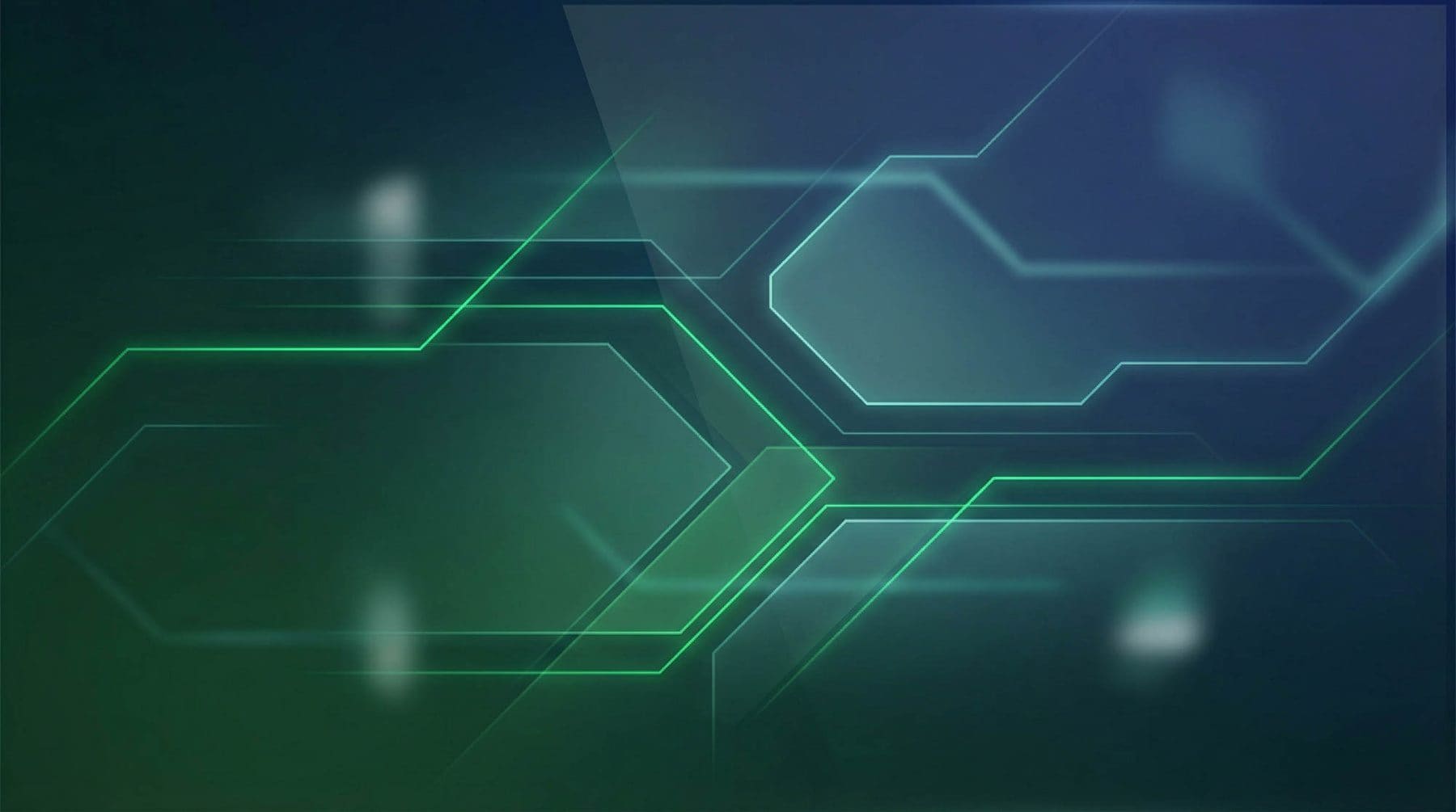

- Cool, green-shifted grade with deep shadows and one light source
- People are anonymous or unidentifiable unless they have consented by name
- Never illustrate a real integrity case with a photograph of an identifiable athlete
- Abstract renders carry structure: hexagons, arcs, signal lines, never generic tech gloss
Slow, once, and never in the way.
Motion signals that something is a system rather than a page. It is used for reveals and state, never for attention.
- One expo ease, cubic-bezier(0.16, 1, 0.3, 1), across the whole system
- Reveals run once on entry and do not repeat on scroll back
- Nothing loops faster than 20 seconds in a page opening
- Hover lifts by 2 to 4 pixels, never scales text
- Everything decorative stops entirely under prefers-reduced-motion
Precise, senior, and never impressed with itself.
We write for people who are accountable for something. They can tell the difference between a claim and a fact, and they resent being sold to.
Do
- British English, one idea a sentence, mostly under 25 words
- Name the instrument, the number and the date, or drop the claim
- Say what a thing does before saying why it matters
- Where the honest answer is that nobody knows yet, write that
Do not
- No superlatives, no revolution, no game-changing
- No seamlessly, robust, holistic, cutting-edge, leverage or unlock
- No fear-selling. The facts are alarming enough without help.
- No claim about a partner, client or figure we cannot source
Everything on this page, in one download.
Vector lockups in SVG, raster exports at three widths in PNG, and a plain-text reference for colour, type, clear space and usage. No registration.
For a bespoke lockup, a co-branded asset, an editorial portrait or anything not in the package, write to press@gamechanger360.co.uk and we will send it the same day.
In the package
- 4 lockups as SVG: primary on light, primary on dark, 360 mark, single-line wordmark
- 12 PNG exports at 512, 1024 and 2048 pixels wide, transparent background
- BRAND-REFERENCE.txt with the palette, type, clear space and the usage rules
Need an asset that is not here?
Co-branded lockups, editorial portraits, product imagery and event assets, sent the same day. Tell us the format and the deadline.